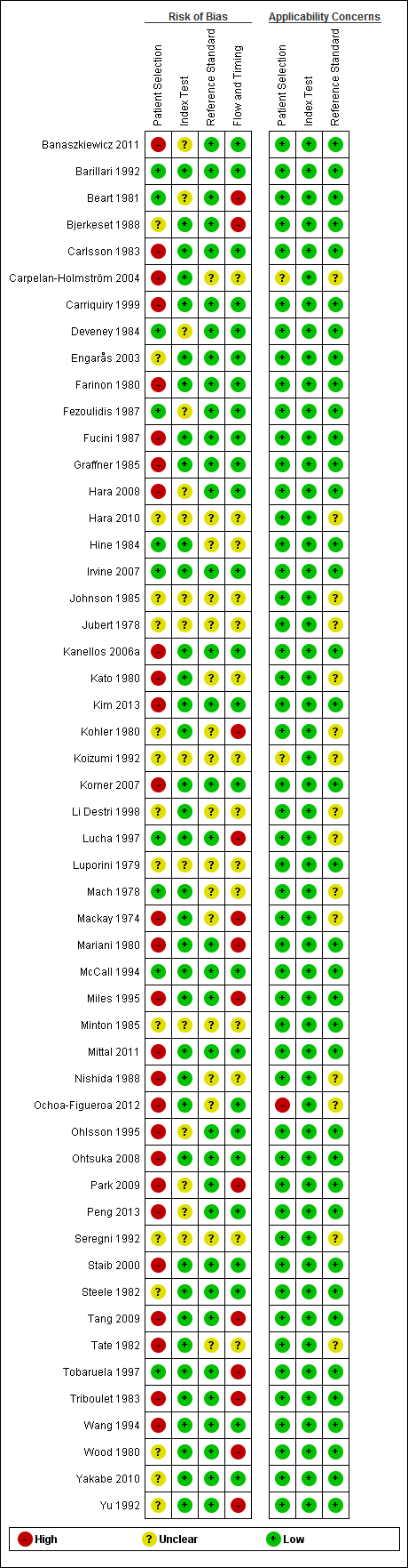
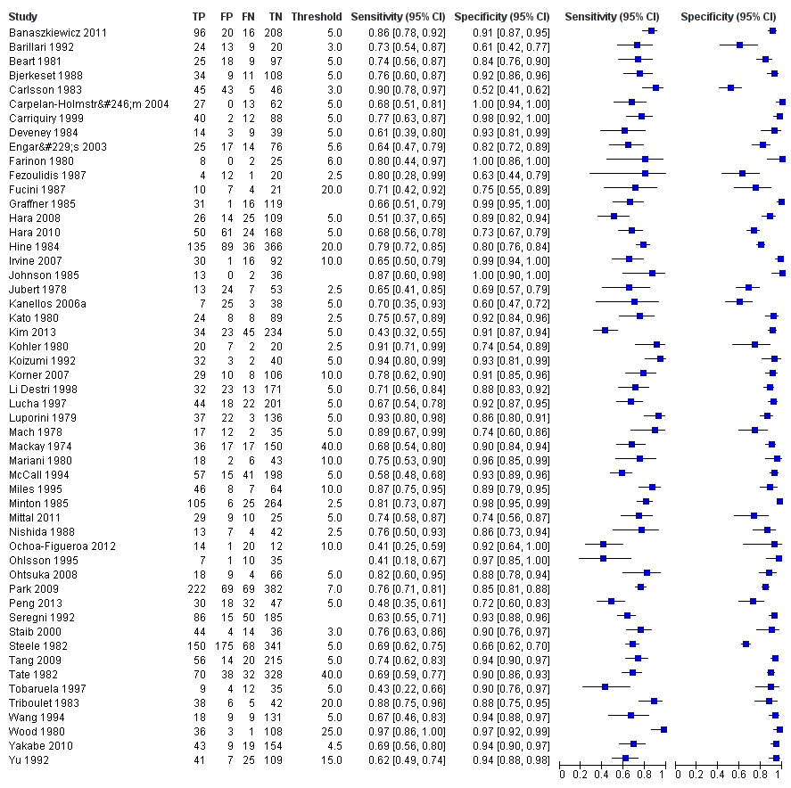
Scolaris Content Display Scolaris Content Display

PRISMA flow diagram: results of the search for studies evaluating the diagnostic accuracy of blood CEA to detect recurrent colorectal cancer in patients following curative resection.
Figuras y tablas -
Figure 1

PRISMA flow diagram: results of the search for studies evaluating the diagnostic accuracy of blood CEA to detect recurrent colorectal cancer in patients following curative resection.

QUADAS‐2 risk of bias and applicability concerns summary including review authors' judgements about each domain for each included study
Figuras y tablas -
Figure 2

QUADAS‐2 risk of bias and applicability concerns summary including review authors' judgements about each domain for each included study

QUADAS‐2 risk of bias and applicability concerns graph including review authors' judgements about each domain presented as percentages across included studies
Figuras y tablas -
Figure 3

QUADAS‐2 risk of bias and applicability concerns graph including review authors' judgements about each domain presented as percentages across included studies

Forest plot for all 52 included studies for the threshold reported closest to 5 µg/L TP = true positive; FP = false positive; FN = false negative; TN = true negativeThe blue square depicts the sensitivity and specificity for each study and the horizontal line represents the corresponding 95% confidence interval for these estimates.
Figuras y tablas -
Figure 4

Forest plot for all 52 included studies for the threshold reported closest to 5 µg/L

TP = true positive; FP = false positive; FN = false negative; TN = true negative

The blue square depicts the sensitivity and specificity for each study and the horizontal line represents the corresponding 95% confidence interval for these estimates.

Scatter plot of sensitivity versus specificity for all 52 studies, regardless of threshold. Each box represents the 2 x 2 data extracted from each study, with the width of the boxes being proportional to the inverse standard error of the specificity and the height of the boxes proportional to the inverse standard error of the sensitivity.
Figuras y tablas -
Figure 5

Scatter plot of sensitivity versus specificity for all 52 studies, regardless of threshold.

Each box represents the 2 x 2 data extracted from each study, with the width of the boxes being proportional to the inverse standard error of the specificity and the height of the boxes proportional to the inverse standard error of the sensitivity.

Forest plot broken down by threshold: CEA at 2.5µg/L, CEA at 5µg/L, CEA at 10µg/L. TP = true positive; FP = false positive; FN = false negative; TN = true negativeThe blue square depicts the sensitivity and specificity for each study and the horizontal line represents the corresponding 95% confidence intervals for these estimates.
Figuras y tablas -
Figure 6

Forest plot broken down by threshold: CEA at 2.5µg/L, CEA at 5µg/L, CEA at 10µg/L.

TP = true positive; FP = false positive; FN = false negative; TN = true negative

The blue square depicts the sensitivity and specificity for each study and the horizontal line represents the corresponding 95% confidence intervals for these estimates.

Summary ROC plot of accuracy at a threshold of 2.5 µg/L. Each box represents the 2 x 2 data extracted from each study. The width of the box is proportional to the number of patients who did not experience recurrence in each study, and the height is proportional to the number of patients that did develop recurrent CRC.The filled circle is the pooled estimate for sensitivity and specificity and the line running through it is the summary ROC curve.The smaller dotted ellipse represents the 95% credible region around the summary estimate; the larger dashed ellipse represents the 95% prediction region.
Figuras y tablas -
Figure 7

Summary ROC plot of accuracy at a threshold of 2.5 µg/L.

Each box represents the 2 x 2 data extracted from each study. The width of the box is proportional to the number of patients who did not experience recurrence in each study, and the height is proportional to the number of patients that did develop recurrent CRC.

The filled circle is the pooled estimate for sensitivity and specificity and the line running through it is the summary ROC curve.

The smaller dotted ellipse represents the 95% credible region around the summary estimate; the larger dashed ellipse represents the 95% prediction region.

Summary ROC plot of accuracy at a threshold of 5 µg/L. Each box represents the 2 x 2 data extracted from each study.The width of the box is proportional to the number of patients who did not experience recurrence in each study, and the height is proportional to the number of patients that did develop recurrent CRC.The filled circle is the pooled estimate for sensitivity and specificity and the line running through it is the summary ROC curve.The smaller dotted ellipse represents the 95% credible region around the summary estimate; the larger dashed ellipse represents the 95% prediction region.
Figuras y tablas -
Figure 8

Summary ROC plot of accuracy at a threshold of 5 µg/L.

Each box represents the 2 x 2 data extracted from each study.

The width of the box is proportional to the number of patients who did not experience recurrence in each study, and the height is proportional to the number of patients that did develop recurrent CRC.

The filled circle is the pooled estimate for sensitivity and specificity and the line running through it is the summary ROC curve.

The smaller dotted ellipse represents the 95% credible region around the summary estimate; the larger dashed ellipse represents the 95% prediction region.

Summary ROC plot of accuracy at a threshold of 10 µg/L. Each box represents the 2 x 2 data extracted from each study.The width of the box is proportional to the number of patients who did not experience recurrence in each study, and the height is proportional to the number of patients that did develop recurrent CRC.The filled circle is the pooled estimate for sensitivity and specificity and the line running through it is the summary ROC curve.The smaller dotted ellipse represents the 95% credible region around the summary estimate; the larger dashed ellipse represents the 95% prediction region.
Figuras y tablas -
Figure 9

Summary ROC plot of accuracy at a threshold of 10 µg/L.

Each box represents the 2 x 2 data extracted from each study.

The width of the box is proportional to the number of patients who did not experience recurrence in each study, and the height is proportional to the number of patients that did develop recurrent CRC.

The filled circle is the pooled estimate for sensitivity and specificity and the line running through it is the summary ROC curve.

The smaller dotted ellipse represents the 95% credible region around the summary estimate; the larger dashed ellipse represents the 95% prediction region.

CEA ‐ all thresholds.
Figuras y tablas -
Test 1

CEA ‐ all thresholds.

CEA at 2.5µg/L.
Figuras y tablas -
Test 2

CEA at 2.5µg/L.

CEA at 5µg/L.
Figuras y tablas -
Test 3

CEA at 5µg/L.

CEA at 10µg/L.
Figuras y tablas -
Test 4

CEA at 10µg/L.

Summary of findings 1. Summary of results table: different cut‐offs

Review question: What is the accuracy of single‐measurement blood CEA as a triage test to prompt further investigation for colorectal cancer recurrence after curative resection?

Population: adults with no detectable residual disease after curative surgery (with or without adjuvant therapy)

Studies: cross‐sectional diagnostic test accuracy studies, cohort studies, and RCTs, reporting 2 x 2 data

Index test: Blood carcino‐embryonic antigen (CEA)

Reference standard: appropriate¹ imaging, histology, or routine clinical follow‐up

Setting: primary or hospital care.

Subgroup

Number
(Studies)

Sensitivity (95% CI)

Specificity (95% CI)

Interpretation

Assuming a constant incidence of 2%² recurrence at each measurement point, testing 1000 people will have the following outcome depending on the CEA threshold applied

2.5 µg/L

1515 (7)

82% (78 to 86)

80% (59 to 92)

16 cases of recurrence will be detected and 4 cases will be missed.
196 people will be referred unnecessarily for further testing

5 µg/L

4585 (23)

71% (64 to 76)

88% (84 to 92)

14 cases of recurrence will be detected and 6 cases will be missed.
118 people will be referred unnecessarily for further testing

10 µg/L

2341 (7)

68% (53 to 79)

97% (90 to 99)

14 cases of recurrence will be detected and 6 cases will be missed.
29 people will be referred unnecessarily for further testing

1as defined in the Reference standards section of the Methods.
2three‐monthly prevalence is estimated as 2%, as the median prevalence amongst the included studies was 30% and a standard follow‐up schedule will include 14 to 15 CEA tests over five years.

Figuras y tablas -
Summary of findings 1. Summary of results table: different cut‐offs
Summary of findings 2. Outcome of follow‐up testing using a CEA threshold of 2.5 µg/L

Month when CEA measured

per 1000 patients tested at a threshold of 2.5 µg/L

False alarm rate

Estimated recurrences¹

Referrals for raised CEA

Cases of recurrence detected

Cases of recurrence missed

False alarms (cases investigated when cancer not present)

Follow‐up years 1 and 2: 3‐monthly CEA testing

3

19

212

16

3

196

92%

6

19

212

16

3

196

92%

9

39

224

32

7

192

86%

12

39

224

32

7

192

86%

15

37

223

30

7

193

87%

18

37

223

30

7

193

87%

21

31

219

25

6

194

89%

24

31

219

25

6

194

89%

Follow‐up years 3, 4 and 5: 6‐monthly CEA testing

30

46

229

38

8

191

83%

36

36

223

30

6

193

87%

42

27

217

22

5

195

90%

48

25

216

21

4

195

90%

54

17

211

14

3

197

93%

60

14

208

11

3

197

95%

1Estimates are based on data reported by Sargent 2007. Three‐monthly data were unavailable, and so constant rates were assumed during each six‐month period for the first two years. Estimates are rounded.

Figuras y tablas -
Summary of findings 2. Outcome of follow‐up testing using a CEA threshold of 2.5 µg/L
Summary of findings 3. Outcome of follow‐up testing using a CEA threshold of 5 µg/L

Month when CEA measured

per 1000 patients tested at a threshold of 5 µg/L

False alarm rate

Estimated recurrences¹

Referrals for raised CEA

Cases of recurrence detected

Cases of recurrence missed

False alarms (cases investigated when cancer not present)

Follow‐up years 1 and 2: 3‐monthly CEA testing

3

19

131

13

6

118

90%

6

19

131

13

6

118

90%

9

39

143

28

11

115

80%

12

39

143

28

11

115

80%

15

37

142

26

11

116

82%

18

37

142

26

11

116

82%

21

31

138

22

9

116

84%

24

31

138

22

9

116

84%

Follow‐up years 3, 4 and 5: 6‐ monthly CEA testing

30

46

147

33

13

114

78%

36

36

142

26

10

116

82%

42

27

136

19

8

117

86%

48

25

135

18

7

117

87%

54

17

130

12

5

118

91%

60

14

128

10

4

118

92%

1Estimates are based on data reported by Sargent 2007. Three‐monthly data were unavailable, and so constant rates were assumed during each six‐month period for the first two years. Estimates are rounded.

Figuras y tablas -
Summary of findings 3. Outcome of follow‐up testing using a CEA threshold of 5 µg/L
Summary of findings 4. Outcome of follow‐up testing using a CEA threshold of 10 µg/L

Month when CEA measured

per 1000 patients tested at a threshold of 10 µg/L

False alarm rate

Estimated recurrences¹

Referrals for raised CEA

Cases of recurrence detected

Cases of recurrence missed

False alarms (cases investigated when cancer not present)

Follow‐up years 1 and 2: 3‐ monthly CEA testing

3

19

42

13

6

30

70%

6

19

42

13

6

29

70%

9

39

55

27

13

29

52%

12

39

55

27

13

29

52%

15

37

54

25

12

29

53%

18

37

54

25

12

29

53%

21

31

50

21

10

29

58%

24

31

50

21

10

29

58%

Follow‐up years 3, 4 and 5: 6‐ monthly CEA testing

30

46

60

31

15

29

48%

36

36

53

24

12

29

54%

42

27

48

19

9

29

61%

48

25

46

17

8

29

63%

54

17

41

11

6

30

72%

60

14

39

10

5

30

75%

1Estimates are based on data reported by Sargent 2007. Three‐monthly data were unavailable, and so constant rates were assumed during each six‐month period for the first two years. Estimates are rounded.

Figuras y tablas -
Summary of findings 4. Outcome of follow‐up testing using a CEA threshold of 10 µg/L
Table Tests. Data tables by test

Test

No. of studies

No. of participants

1 CEA ‐ all thresholds Show forest plot

52

9717

2 CEA at 2.5µg/L Show forest plot

7

1515

3 CEA at 5µg/L Show forest plot

23

4585

4 CEA at 10µg/L Show forest plot

7

1607

Figuras y tablas -
Table Tests. Data tables by test